
You have created numerous dashboards featuring clean layouts, interactive filters, and all the essential elements.
Still, stakeholders ask for the same numbers in Excel. They question the data. Some don’t open the dashboards at all. This isn’t about visuals or tooling. It’s about trust.
When every dashboard defines metrics differently, confusion takes over. And when data teams can’t align on what “Revenue” or “Churn” means, even the best dashboards get ignored.
So, this isn’t a dashboard problem; it’s a metrics problem.
In this guide, we’ll give a comparison of metrics layer vs. dashboards and show how fixing your foundation changes everything.
The Problem – Why Dashboards Keep Failing In Modern Analytics?
Most analytics leaders still chase better visuals or faster load times, hoping it’ll finally drive dashboard adoption. But the problem runs deeper.
It’s not the charts. It’s the chaos behind the metrics.
Modern organizations work in hybrid data stacks, across dozens of tools, with analysts defining KPIs on the fly. The result? Everyone sees different numbers for the same question.
Let’s break down why this happens and what you should be fixing instead.
Everyone Builds Metrics Differently
Ever looked at two dashboards showing the same KPI… with two different numbers?
That’s not just frustrating — it’s a trust killer.
Here’s why: most dashboards embed their own metric logic. One analyst joins a table this way, another filters it differently. Aggregations vary based on who built what and for whom.
- “Active Users” could mean past 7 days in one tool, 30 days in another
- One dashboard includes test accounts, another filters them out
- Revenue might be gross, net, or booked — depending on who’s asking
You’re not reporting performance — you’re debating definitions.
And once that trust breaks, you’ll see it everywhere: in duplicated dashboards, endless Slack threads, and people copy-pasting numbers into Google Sheets.
“Wait… which one’s the real number?”
That question is the start of failure — not just for a dashboard, but for your entire data culture.
No Shared Understanding Of KPIs
Ask five teams what “Monthly Revenue” means, and you’ll get five different answers.
Without a centralized, governed source of truth, confusion spreads fast. Marketing blames the Product. Product blames Finance. And RevOps? They’re left stuck in the middle.
This isn’t just frustrating — it blocks decisions and wastes time.
When every team defines metrics differently, here’s what happens:
- Reports conflict across tools and departments
- Meetings turn into number-matching exercises
- Teams delay action because they don’t trust the data
- BI teams spend hours resolving inconsistencies
What’s missing is a metrics definition layer — a shared, reusable logic that ensures everyone’s speaking the same data language.
Because if your CEO can’t trust the definition of “churn,” they won’t trust the dashboard either.
Dashboards Become Static Slide Decks
You didn’t build dashboards so people could take screenshots for their QBR decks and never look again.
But that’s exactly what happens.
When trust disappears and definitions vary, dashboards lose their value. Instead of real-time insight, they become frozen snapshots. Used once. Forgotten after.
You’ve built a live product and they treat it like a PDF.
This kills momentum across the org:
- Analysts stop iterating on dashboards — no one’s using them anyway
- Stakeholders default to asking data questions in Slack
- Excel exports replace dynamic insight
Ask yourself: Are your dashboards actually being used as tools? Or just illustrations?
If it’s the latter, the fix isn’t better design — it’s better metrics.
Why Metrics Layers And Dashboards Work Better Together
It’s not “dashboards vs. metrics layers.” It’s “dashboards plus metrics layers.”
When we work with clients who feel their BI stack is failing, the problem almost always sounds the same:
“We’ve built 60 dashboards but no one’s using them.”
That’s not a design flaw. It’s a foundation flaw.
Dashboards do a great job of showing the “what.” But without a metrics layer underneath, they can’t explain the “why,” and they can’t be trusted at scale.
Here’s how both layers should complement and not compete:
Dashboards Visualize, Metrics Layers Standardize
Dashboards are visual storytellers.
They help stakeholders spot trends, patterns, and anomalies. But what good is a trendline if no one believes the metric behind it?
This is where metrics layers shine. They define the governed metrics underneath every chart. So when someone sees a spike in “Churn Rate,” they know exactly how it was calculated, and that the same logic powers every other tool.
Here’s the breakdown:
| Dashboards | Metrics Layers |
| Show data in charts & tables | Define the logic behind each KPI |
| Built for stakeholders & decision-makers | Built for engineers, analysts, and systems |
| Easy to use, fast to explore | Hard to build, critical for trust |
| Can become inconsistent without standards | Bring consistency across all tools |
A dashboard without a metrics layer is like a report without a source.
The result? Misalignment, rework, and users who second-guess every number they see.
Metrics Layers Guide, Dashboards Activate
You shouldn’t build dashboards first.
Yet that’s how most teams operate — they start dragging charts before they’ve defined what the metrics mean.
Instead, let your metrics layer guide the logic. Once you have that shared definition of “Revenue” or “Customer Lifetime Value,” then — and only then — should you plug it into dashboards to make the data come alive.
- The metrics layer answers: What is the logic?
- The dashboard answers: What’s happening with that logic right now?
Think of the metrics layer as your GPS. The dashboard is the map.
Without one, the other might get you somewhere — but you’ll waste time, hit detours, and probably lose trust along the way.
Metrics Power Tools, Dashboards Offer Insights
Your dashboards are just one of many interfaces consuming your metrics.
That’s why scaling starts with the metrics layer — not the dashboard.
Once defined, metrics can power:
- Notebooks and data apps (Hex, Streamlit)
- AI tools and agents (chatbots, copilots)
- Embedded analytics (customer-facing dashboards)
- Excel and Google Sheets
- Alerts and anomaly detection
- Your dashboards — Tableau, Power BI, Looker, and more
The key point? Dashboards are a view layer, not a logic layer. And when you treat them as such, you free your metrics to be used everywhere, not locked inside one tool.
Want to future-proof your stack?
Start with reusable metrics — not one-off dashboards.
Metrics Layer Vs. Dashboards — Core Differences Explained
Dashboards and metrics layers aren’t interchangeable — they’re purpose-built for different needs. But because most teams only see the dashboard layer, they try to force it to do everything:
Define KPIs. Visualize insights. Manage governance. Drive adoption.
It’s too much for one layer to handle and that’s why most dashboards fail.
Still wondering where one stops and the other starts?
Let’s break down the core differences between metrics layers and dashboards so you can design an architecture that actually scales.
| Dimension | Metrics Layer | Dashboards |
| Purpose | Define and centralize metric logic | Visualize and communicate data |
| Audience | Data engineers, analytics engineers, systems | Business users, stakeholders, decision-makers |
| Technology | YAML (dbt), LookML, APIs, semantic layers | BI tools like Tableau, Power BI, Looker |
| Governance | Version-controlled, Git-backed, tested | Typically ad-hoc, logic embedded in visuals |
| Reusability | Fully reusable across tools (dashboards, notebooks, AI apps, etc.) | Limited to the specific dashboard or tool |
| Maintainability | Easy to track changes, debug, promote | Hard to track logic changes across dashboards |
| Scalability | Designed for high-scale, multi-team environments | Breaks down with scale or multiple tools |
| Trust & Consistency | Enforces single source of truth for KPIs | Can lead to conflicting numbers across dashboards |
| Data Consumption | Powers BI tools, notebooks, agents, and custom apps | Consumes pre-modeled or raw data |
| CI/CD Compatibility | Built with engineering best practices (PRs, testing, environments) | Manual updates and ad-hoc governance |
Dashboards tell stories.
Metrics layers write the dictionary those stories rely on.
By separating the “what” from the “how,” your analytics stack becomes not just more trustworthy but far more scalable.
Read Also: Cloud Cost Optimization Strategies
When To Use Dashboards – And When To Use A Metrics Layer
Dashboards and metrics layers serve different moments in the analytics lifecycle. And using one in place of the other is like using a thermometer to boil water — wrong tool, wrong context.
Yet most teams still default to dashboards for everything. Even when it breaks. Even when nobody trusts the numbers.
Let’s clarify what each tool is good at so you can stop duct-taping your BI stack and start designing workflows that scale.
Use Dashboards When You Need Visual Insight Fast
Sometimes you don’t need the most governed version of a metric. Instead, you just need to see what’s happening.
That’s where dashboards shine. They’re perfect for high-level overviews, fast insight delivery, and stakeholder communication.
- Presenting QBRs to execs? Dashboard.
- Showing marketing campaign lift to leadership? Dashboard.
- Checking daily sales performance? Yep — still dashboard.
Dashboards are great when you need:
- Speed over scale
- Exploration over precision
- Visual clarity for decision-makers
But here’s the danger: when stakeholders start using them to define core KPIs instead of view them, you’re building logic in the wrong place.
Dashboards are great for storytelling — but bad for storytelling without facts.
If you’re designing for speed or clarity, dashboards work. If you’re designing for scale or trust, they’ll fall short — fast.
Use The Metrics Layer When You Need Consistency At Scale
When your data stack grows, new teams, tools, and dashboards, inconsistency creeps in.
This is where the metrics layer becomes non-negotiable.
Let’s say you’ve got:
- Data scientists in notebooks
- Analysts in Tableau
- Finance working from Excel
- A product team building metrics into an app
Without a shared metrics definition layer, every team is reinventing the same KPIs in different tools, and you’re back in the data trust dead zone.
Use a metrics layer when:
- You support multiple tools or personas
- You need version control for KPI logic
- You’re deploying governed metrics to AI, notebooks, or custom apps
- Your org has medium-to-high data literacy
If your team says, “Let’s just pull the number ourselves,” you need a metrics layer. Yesterday.
Use Both When Building Production Analytics Workflows
This isn’t an either/or decision.
The most effective data stacks today start with a metrics layer, and serve dashboards as an output — not the source.
Here’s what it looks like:
- Define your KPIs in the metrics layer (dbt, LookML, Cube, etc.)
- Version and test that logic
- Feed those metrics into your BI tools (Tableau, Power BI, Looker)
- Let users explore, build, and share insights confidently
This is how high-performing teams build production-grade analytics workflows. They don’t just design pretty dashboards — they design trust-first systems.
Dashboards act as windows. The metrics layer is the foundation.
Use both, but start from the bottom, not the top.
The Metrics Layer In Action – Tooling And Technologies
Knowing why you need a metrics layer is one thing. But knowing how to build one? That’s where most teams get stuck.
The good news? You don’t have to reinvent the wheel. A growing ecosystem of metrics layer tools is designed to help teams define once and reuse everywhere, i.e., across BI tools, notebooks, AI agents, and even spreadsheets.
From code-first frameworks to AI-integrated platforms, here’s a breakdown of the most trusted and trending tools right now for building governed, reusable, scalable metrics layers.
1. dbt Metrics Layer
If your team already uses dbt Core or dbt Cloud, you’re halfway there.
The dbt metrics layer lets you define metrics in YAML, alongside your models, and track them in Git. It brings version control, testing, and deployment workflows and connects naturally to tools like Lightdash, Hex, or even Excel.
Why it works:
- YAML-based definitions (like revenue, churn, active users)
- Fully open-source, integrates cleanly with modern data stacks
- Best for teams with analytics engineers who already use dbt for modeling
Already transforming data in dbt? Add metrics on top — not inside BI tools.
While dbt’s metrics layer is powerful, it requires engineering fluency — best suited for teams aiming to scale metric governance through versioned code.
2. LookML (Looker)
Google’s LookML was one of the first code-first metrics definition layers. It allows teams to define dimensions, metrics, and joins in a declarative language that’s version-controlled, tested, and shareable across dashboards.
LookML is great for:
- Centralized semantic modeling
- Organizations already committed to the Looker ecosystem
- Complex governance and permissioning needs
But here’s the caveat: it’s tied to Looker. You can’t reuse LookML-defined metrics in Tableau, Power BI, or Python notebooks.
Strong for governance, weak for cross-tool flexibility.
Use LookML if you’re a Looker-first organization that values deep control over logic, access, and lifecycle management.
3. Cube.dev
Cube is one of the leading platforms powering the headless BI movement and it’s built for engineering-minded teams that want fast, flexible metric APIs shared across every tool.
What makes Cube unique:
- Exposes metrics as REST and GraphQL APIs
- Pre-aggregates metrics to speed up dashboards and reduce warehouse load
- Connects to any frontend: Tableau, Superset, Hex, Retool, or custom UIs
Ideal for:
- Product analytics, embedded dashboards, customer-facing metrics
- Engineering-heavy teams that want flexibility and scale
- Companies building SaaS analytics features
Want to make metrics available to AI, charts, and code? Cube does that.
If your stack is modern, multi-tool, and API-driven, Cube.dev is one of the most versatile metrics layer platforms on the market.
4. Lightdash
If you’re using dbt Core, Lightdash is the fastest way to go from models to metrics to dashboards, without redefining logic.
Lightdash is an open-source BI tool that reads dbt models and metrics directly from your repo. You can build dashboards on top of your YAML-defined metrics, all while staying inside Git workflows.
Why it works:
- Native support for dbt metrics and semantic models
- Git-first development, pull request reviews, and CI/CD ready
- Clean UI for analysts, no vendor lock-in
Build dashboards without duplicating logic — straight from your dbt repo.
Best for:
Small to mid-sized teams already using dbt, who want metric governance and dashboarding without the complexity of larger tools.
5. Honeydew.ai
Looking for an AI-native interface for your metrics layer? That’s where Honeydew.ai shines.
Built from the ground up for governed AI access, Honeydew connects to your metrics layer. It gives teams a conversational interface to query KPIs in natural language, powered by your approved definitions.
Why it works:
- Natural-language interface over governed metrics
- Supports dbt, Snowflake, and major semantic layers
- Designed for use with AI agents, copilots, and chat assistants
Want your team to ask a chatbot for revenue by segment and get a governed answer? Honeydew makes that real.
Ideal for forward-looking teams exploring AI copilots, prompt-based analytics, or self-serve assistants, but still want full control over metric logic.
6. AtScale
AtScale brings enterprise-grade rigor to the semantic layer, with native integrations into Excel, Tableau, Power BI, and more.
Originally built as an OLAP virtualization platform, AtScale now functions as a powerful BI metrics layer with caching, role-based access, and strong support for financial teams that live in spreadsheets.
Why it works:
- Excel-native experience for finance, ops, and planning teams
- Virtual cube engine for performance, governance, and scalability
- API-ready for consumption by AI, apps, and BI tools
Still have power users living in Excel? AtScale helps govern that chaos without forcing migration.
Best for:
Enterprises with hybrid tools, strict governance requirements, and cross-platform usage needs.
Each of these platforms reinforces the same truth:
- The future of BI isn’t locked inside dashboards.
- It’s metrics-defined, API-powered, and tool-agnostic.
Choose the tool that fits your stack but design the architecture that fits your future.
Read Also: Best Semantic Layer Tools To Use
How To Deploy A Metrics Layer That Actually Gets Used
You’ve seen the tools. You understand the value.
But here’s the truth most vendors won’t tell you: just setting up a metrics layer isn’t enough. Teams spin up YAML files, define KPIs… and three months later, nobody’s using them.
Does it make sense?
The key to success is adoption by design, where usage is not just encouraged, but embedded into your process.
Here’s how to get there:
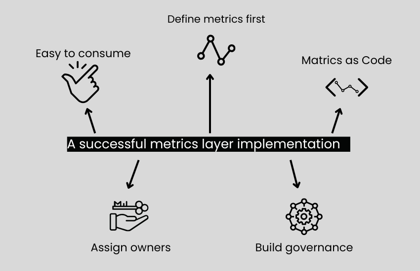
1. Define Metrics Before Dashboards
If your dashboards are defining metrics, you’ve already lost.
We’ve worked with teams where three dashboards had three different formulas for “Monthly Recurring Revenue.” Why? Because the logic was embedded after the visuals were created.
Flip the order.
Start your analytics stack with:
1. Source data
2. Data modeling
3. Metrics definitions
4. Dashboards and visuals
Build your metrics first, centrally and cleanly, and make dashboards consumers of that logic.
Your dashboards should never create definitions. They should only use them.
This single change eliminates rework, improves trust, and creates a system that scales.
Read Also: Data Modeling Best Practices
2. Treat Metrics As Code
Spreadsheets get messy. Dashboards drift. But code scales — and metrics should be no different.
Define your metrics in YAML, LookML, or code, and store them in version-controlled repositories like GitHub or GitLab. Then apply the same practices you’d use for production code:
- Pull requests for every change
- CI/CD pipelines to test metric logic
- Automated checks for freshness, completeness, and anomalies
- Audit logs to trace changes over time
This is how you move from “BI as reporting” to BI as a product.
If it’s not in Git — it’s not governed.
And once your metrics layer becomes a code asset, it becomes easier to scale, easier to test, and harder to break.
3. Make It Easy To Consume
Even the best-defined metrics will die if they’re hard to access.
Don’t hide them behind a dev-only interface. Instead, build interfaces that bring your metrics layer into the tools your teams already use:
- SQL Snippets for analysts
- API access for engineers and AI agents
- Excel/Google Sheets connectors for operations teams
- BI integrations for Tableau, Looker, Power BI
- Prompt-ready UIs for AI copilots or chatbot-style assistants
Governance doesn’t mean locking metrics down. It means making the right version easy to use, everywhere.
The easier it is to access your metrics, the less likely people will reinvent them.
4. Assign Owners Right Away
One of the biggest drivers of metrics sprawl is lack of ownership.
If no one owns “Revenue,” guess what happens?
- Finance builds one version
- Product builds another
- Sales uses whichever supports their story
That’s not alignment. That’s chaos.
Every key metric in your layer should have a clear owner:
- Who defines it?
- Who approves changes?
- Who answers questions about it?
Even if you start small, say, with five core metrics, assigning ownership from day one prevents silent drift and political debates later.
5. Build Governance Early
Don’t treat governance as a nice-to-have but as infrastructure.
The earlier you bake in metric governance, the faster you’ll scale with confidence.
Here’s what that means:
- Document logic and intent for every metric
- Apply naming conventions for clarity
- Set access controls for who can edit vs. who can consume
- Build testing frameworks to validate metric freshness and completeness
This isn’t overhead, it’s what separates trusted analytics from forgotten dashboards.
Governance is what turns metrics from “someone’s guess” into “the company standard.”
Conclusion – Dashboards Are Outputs, Not Definitions
If your dashboards are defining your KPIs, you’re setting your data strategy up to fail.
You wouldn’t let every team invent their own financial model. So why let every dashboard define “Revenue,” “Churn,” or “Retention” differently?
The real problem isn’t dashboards — it’s treating them like a source of truth.
A dashboard without a metrics layer is just PowerPoint with SQL. It might look good, but it breaks under pressure, can’t scale across tools, and slowly erodes trust.
If you want adoption, alignment, and action, you have to decouple metric logic from visualization.
That’s why we believe the future of business intelligence doesn’t lie in the “metrics layer vs. dashboards” debate.
It lies in building systems where:
- Metrics layers define trusted, governed logic
- Dashboards bring that logic to life — across tools, users, and workflows
- Teams operate from one shared source of truth, no matter the interface
This is how you stop building dashboards no one uses and start delivering insight your whole org trusts.
Ready To Fix The Foundation?
If you’re tired of debating definitions, reconciling reports, and rebuilding dashboards every quarter, it’s time to rethink your stack.
Let’s talk about how to:
- Define your core KPIs with confidence
- Roll out a production-ready metrics layer
- Drive dashboard adoption with data people actually trust
We’ve helped dozens of teams design analytics systems that scale. Let’s build yours.
Book a free consultation now!